Three Branches Square


The competition for the Três Poderes Square, in Florianópolis, envisioned the connectivity to the urban fabric and the recognition of an important group of buildings in its surroundings.
An integration to the local public transportation system was desired and special attention was recommended to the possible conflict between cars and pedestrians.
Promoted by the City Hall of Florianópolis through the assistance of many secretariats, it was suggested that existing potentials in the area where taken into consideration.
The public structure cannot be separated from the Polis. In this sense, we are discussing what the essence of the urban space represents. It must contribute to the formulation of a feeling of belonging, of the civic and the readability of a place.
The Três Poderes Square in Florianópolis brought up these issues and the strategy we used was precisely to explore the dimensions of this commitment.
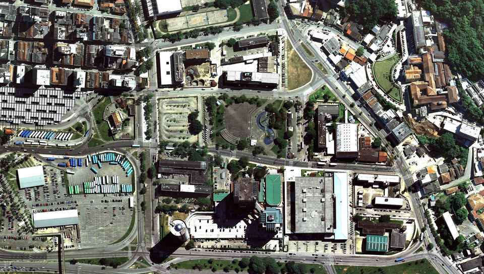
The square currently shows no vital characteristics and is nothing more than a residual space, the result of a fragmentation of built masses around the square. Because of its segregation from its surroundings, we considered the square to be an independent object, but in the future it would be able to act as a catalyst for future urban occupations and energize its immediate surroundings.
The first step to consolidate this area into an institutional centrality was to upgrade the square. It was therefore necessary to establish guidelines and specific urban features for the bordering street blocks, including procedures for new construction and urban density parameters, which should be compatible with local characteristics, stimulating the usage of the square as well as the entire area.
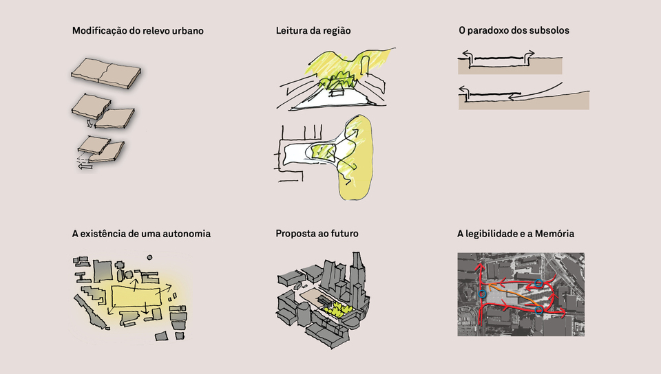
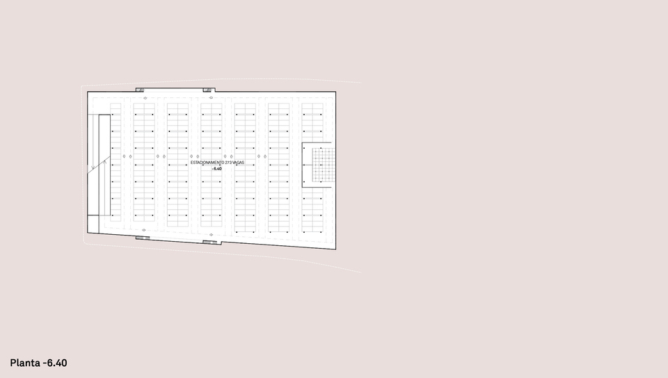
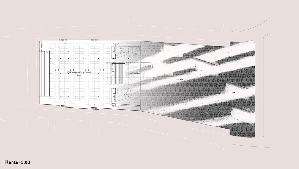
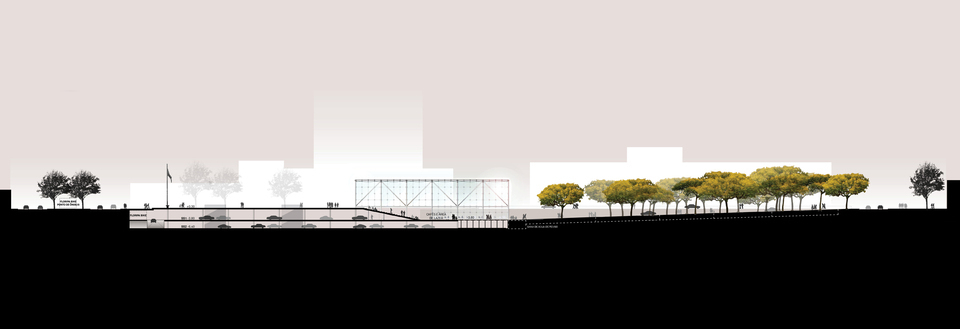
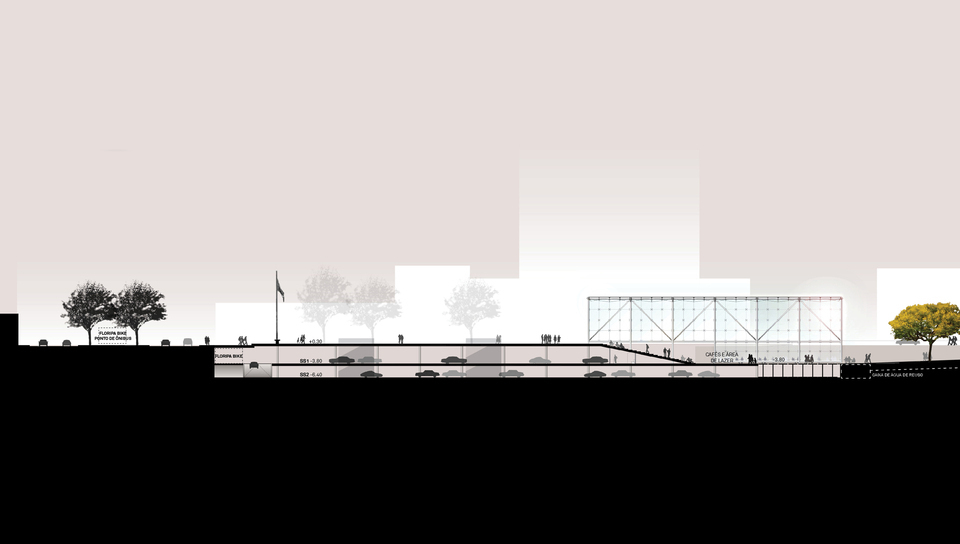
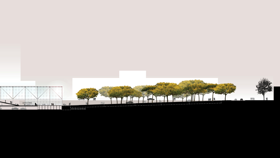
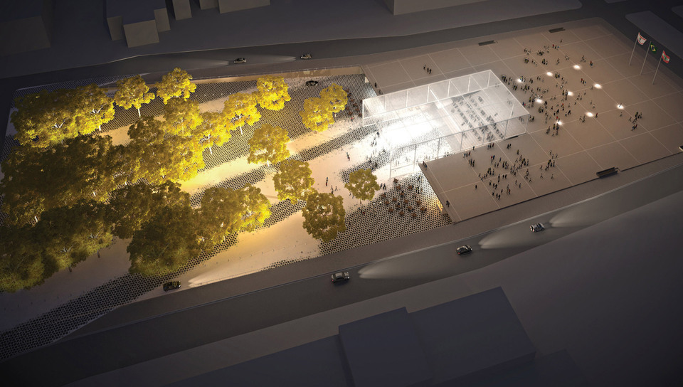
Always delivered as a space of rational functionality where meaningful attempts of connections and spatial experiences are no longer visible, the underground, undeniably extended as an afterthought, is one of the central strategic themes. In this case, the underground reverses this condition, creating an element able to enhance the urban character: it is the continuity of the square (with horizontal slabs and ramps of 3 to 6% slopes) that nests the amphitheater and the events.
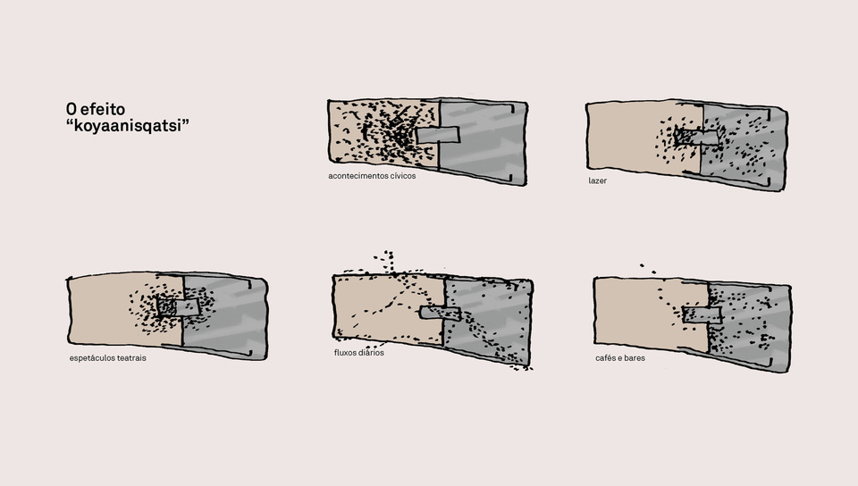
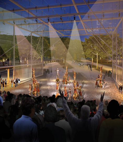
The amphitheatre is the result of the great plans intersection and is the square´s big lighthouse in the evening. The center of events.
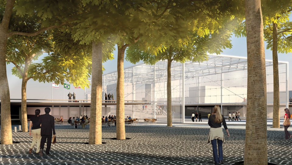
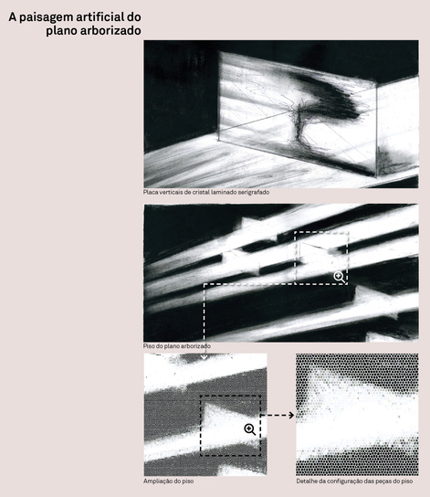
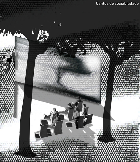
The light was used as a resource to the ambiance of the free space, suggesting even the ownership. Indirect lighting in the trees creates a ‘green roof’ while low reflectors adjacent to the ground define elongated shadows of people, which by overlapping to the floor paving, generate a new composition. The artist Victor Lema Riqué greatly contributed both in the concept and in graphic and ambiance definition of this feature of the project.
Modifications of the “Urban Landscape”
By sliding the “tectonic plates” we are able to reshape the landscape and create a new panorama.
Understanding the Site
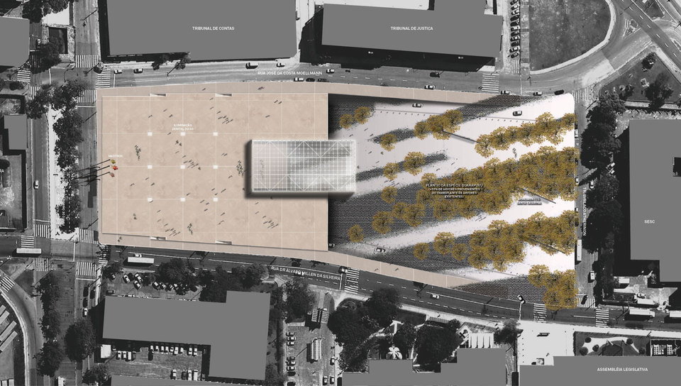
An overall understanding of the area invited us to create a dialog with its surroundings identifying two predominant areas:
- The Northwest, which is the consolidated center, offering areas for public events and festivities of a minimalist character;
- The Southeast, the green of the hills (Mariquinha e Mocotó protection areas),
the areas for gatherings, the “social encounter nooks”. The sloped plane.
Usage
The way people move and occupy places is what gives them meaning. The ambiance of the open space was mainly guided by the work of Victor Riqué: “to stretch the shadow of the trees that compose the landscape plan throught the effect of light and its own shape means to multiply the infinite privilege of nature. On the other hand, it searches for a scenic ambiance where the citizen feels part of a living scenography”.
The “hard projection” of tree shadows combined to the placement of vertical crystal planes – with silkscreened images – would compose “social encounter nooks”.
When walking under the trees, we would be able to experience a sunny meadow, shaded corners, different types of pavement, each one with its unique qualities, stimulating different activities… To feel free to wander, claiming favorite spots away from traditional conventions.
The continuity of the floor patterns, invading the commercial areas would reinforce the integration of these activities.
Location:
Florianópolis, SC
Year:
2010-in progress
Client:
Florianópolis City Hall / IPUF
Intervention area:
20.500 m²
Concurso:
National Competition, 1st Prize
Architecture and Urbanism:
VIGLIECCA&ASSOC
Hector Vigliecca, Luciene Quel, Ronald Werner Fiedler, Neli Shimizu, Caroline Bertoldi, Thaísa Fróes, Fabio Pittas, Kelly Bozzato, Pedro Ichimaru, Bianca Riotto, Aline Ollertz, Sergio Faraulo, Fernanda Trotti, Fabio Galvão, Amanda Rodrigues, Paulo Serra, Luci Maie
Invited artist:
Victor Lema Riqué



 Images